Wednesday, April 20, 2011

Location and Learning

SP: Nurse on the job
Image: SP Nurse on the Job by dharder9475
In the last few weeks I've been thinking about how we can support the learning that takes place when medical students are on placement. We know that entering wards can be a daunting experience for students. They don't feel part of a team. They don't know who everyone is. They don't understand what is happening. They don't want to interrupt nurses attending to patients or junior doctors catching up with paperwork at desks.They see other members of the team wandering in and out of the ward but they don't know what their role is. They don't recognose the social worker or the pharmacist or the OT.   They might not even know what their own role is. They miss out on opportunities to attend meetings and teaching sessions because they don't know they are happening. In fact they spend too long waiting around for someone else to turn up to teach them, and on activities that have little educational value. They generally have a haphazard learning experience.

But placements are very rich environments with many unique opportunities to learn.

So what can we do?

Imagine instead that before coming to the ward the students had access to a network which let them find the profiles of all the staff who worked on that ward. They could see the timetables for teaching. They could even see what the last students who had been on this placement had seen and learnt. They can select what they would they would particularly like to gain from the placement, and this will become part of their profile which will also be available to all the staff on the ward. The network will also contain links to information about initiatives that are happening in the ward to address patient safety and quality improvement. They students can see if there are opportunities for them to get involved in this work and learn about the input their colleagues have had in the past.

When they turn up on the ward the students check in. They can see the profiles of the staff who are working there and when they should be finishing, when they will be on call and what clinics or theatre sessions they will be doing that week. Their calendar updates with activities that are happening that day that they should know about.

The network that they are tapping into is the same one that all the staff in the hospital use to keep themselves up to date. The students can record their learning and their thoughts about how the ward works. Their input is valued by the staff on the ward and their fellow students from other disciplines.

Do you think this will happen soon? Why hasn't it happened already? And how could patients use this network?

Saturday, April 16, 2011

Lies, damned lies and statistics: How do you turn 61% into 95%?

Image from "Working together for a stronger NHS" Crown Copyright


Edit: 13/05/11 An analysis of the BSA 2007 dataset by Siobhan Farmer, Mark Hawker and myself has been published today in the new publication Lancet UK Policy Matters. You can find it here. We conclude that it is not possible to conclude that 95% of respondents wished for more choice. Using the kind of suppositions given below it may be possible to infer that between 61% and 72% may have thought there should be more choice, but the survey was not designed to answer this question. 
..........................................................................................................................................................
Edit: 17/4/11 I and a colleague have independently tried to verify Mark's analysis. We have reached similar conclusions but they don't corroborate Mark's results. Unfortunately he is currently outside the UK. We will update with our own results in the UK. We are in agreement that there is still no justification for claiming that "95% of people want more choice in healthcare". 

..................................................................................................................................................................
Today many of you will have read Ben Goldacre's excellent  analysis of the leaflet which the Department of Health issued last week to help the public understand why they were pursuing reforms of the NHS which are facing widespread opposition

Page 11 of the leaflet contains the graphic above stating that 95% of those surveyed in the 25th British Social Attitudes Survey  wanted MORE choice in the NHS. When Ben looked at the published reports he found that 'Do you want more choice in the NHS?' was not a question in the survey. Instead respondents were asked 'How much choice do you think you should have?' and 'How much choice do you actually have?'  But if you could establish how many people thought they should have choice but who currently think that they don't have choice then you might be able to say how many people think that they should have more choice. As Ben points out to answer this you would need to have individual level data. When he asked the DOH for the dataset they unfortunately pointed him to a book chapter.

But fortunately the day this leaflet was published, April 6th, 2011, Mark Hawker  started wondering if he could find out more about this dataset. And he did find more. The individual level data is available to download. So Mark did that. Then he analysed it. And what did he find?  Well, you can read a lot more in the blog post that he published on April 7th but here is a summary.

13% thought they had more choice that they thought they should have.
46% thought they had just the right amount of choice.
41% thought they should have more choice that they had.

So how did the DOH manage to get this so wrong? How did they confuse 41% with 95%? Why weren't they able to direct Ben Goldacre to the correct data source? And why have they decided not to fund this survey in the future?

Hopefully someone can help make the correct data look just as pretty as the incorrect infographic in the leaflet. In the meantime I think I'd like to thank Mark for his work, and to agree with this tweet:

Thursday, March 10, 2011

Don't Think Websites, think data

What the non-geeks including me, need to understand. Check out this SlideShare Presentation:

Wednesday, March 9, 2011

A medical student's thoughts on empathy and #meded

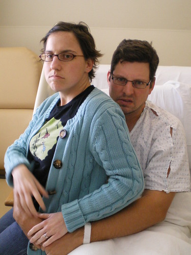
Patient + Wife by polaroid667
Patient + Wife a photo by polaroid667 on Flickr.
Today during the twitter conversation Gautam went back to one of my old blog posts on empathy and left a comment that I think deserves its own post, so I have posted it below. Much of what he writes strikes me as very true and accurate. What is the solution?

"I think the crux of the problem is the practitioners that medical students train with. I'm a final year in Sheffield and even though we have 12 weeks of general practice over two separate sessions, that leaves around 2.75 YEARS of training in hospital.

My own opinion is that in-hospital practitioners are less empathic because the prevailing attitude is that patients are problems to be solved. The 'House MD' way of looking at things still prevails amongst many practitioners - particularly surgeons but equally amongst medical physicians. Students are 'taught' empathy but equally, are (not overtly) dissuaded from feeling it, talking about it and dealing with it. The pressure is to deal with the 'real' problems - the broken leg, the tweaking of medication doses - and ignore the 'BS' - the trauma of losing a child or partner (unless they can be referred for CBT).

Contrasting hospital care to general practice, the existence of a lasting relationship between doctor and patient means that these concerns have to be taken more seriously simply because the patient is a recurring figure in the doctor's professional life. In other words, it makes sense to deal with these patients as people, rather than as problems.

Now, this theory of mine (as weakly-backed by evidence as it is!) holds some water, I feel, since patients who are seen in clinic regularly are treated differently by consultants. These patients' problems are listened to, their concerns are heard and dealt with as much as is possible. Time constraints exist with patients on the ward, as well, but for some reason, (perhaps worries about confidentiality and privacy?) they are not covered as completely.

Medical students can be taught to reflect and encouraged to empathise by the medical schools as much as possible. But while they are taught as apprentices by overworked and jaded physicians and surgeons who may not have time to empathise as much as they'd like to, true empathy remains out of reach."

Thank you, Gautam.

A twitter conversation with UK medical students about empathy

Saturday, March 5, 2011

Antidepressant prescribing in England: variation may not be as great as Guardian map suggests.

The Guardian published a story on March 5th, 2011, showing that the crude rate of anti-depressant prescribing in some areas of England was more than 3 times higher than in others.The highest rate of prescriptions was in Blackpool, and the lowest in Kensington and Chelsea.
The data was from publicly available sources and is linked to from the Guardian website. The journalists give this description of their method :
"How did we arrive at our figures? First, we gathered prescription data from the online database managed by the NHS Information Centre.

This quarterly information was compiled to get annual numbers covering 1 April 2009 to 31 March 2010 – the most recent full year with available data. In order to make the numbers comparable, we then linked the raw prescription numbers to the ONS mid-year population estimates.
This allowed us to calculate the prescriptions per 100,000 figure in the data below, which controls for the different sizes of PCTs, if not their different levels of wealth, employment and general illness."

The data is also not age standardised. In the comments section some have suggested that in areas with low numbers of prescriptions doctors may be prescribing several months prescriptions at one time. I have looked at the most recent data set available (July-August 2010). Data is available on the total cost of the prescriptions as well as the number of prescriptions and these are plotted below.


This shows a clear correlation between number of prescriptions and cost. However when one looks at individual PCTs the average cost of an antidepressant prescription in Kensington and Chelsea PCT is £7.01, whilst in Blackpool PCT it is £3.48. This does suggest that either more expensive antidepressants are being prescribed in Kensington and Chelsea, or more months prescriptions are being given at one time. Since the absolute number of prescriptions in Kensington and Chelsea is so much lower than in Blackpool, it may be that more antidepressants are being prescribed in each prescription. 


When looking at datasets it's good to make use of all that is available.


You can find my spreadsheet here.


EDIT 4.20pm 6/3/11 I've calculated a rate of prescribing of antidepressants per 1000 of population over 19. (This is not ideal as some teenagers may be prescribed antidepressants, but more accurate than using the total population including children). This has been plotted against average cost of antidepressant prescription. This shows that Blackpool and Kensington and Chelsea are outliers. 


There is not a strong relationship between cost of prescriptions and number of prescriptions. This may explain some of the variation between north and south of England, but the long-established relationships between deprivation and depression are likely to have greater explanatory power.


Here is a link to some papers on that relationship and a very interesting report (via @coxar) on the relationship between antidepressant prescribing, poisoning by antidepressants and deprivation.